← Index / Graphic Design
Olio-E
- Year
- 2025
- Discipline
- Graphic Design
- Tools
- Illustrator, Photoshop, InDesign
- Medium
- ADOBE — BRAND KEY VISUAL
Extra vergine — Monte Pisano, Tuscany
A hidden pearl of Tuscany, where the olive groves are older than the towns beneath them.
olio-e.shop
Context
An identity was needed before the shop was.
Olio-E is two olive-oil sommeliers' initiative to bring extra vergine olive oil from Tuscany hills to Poland. They buy from named producers there and sell the result in one place.
Before any of it could be sold it had to be recognisable: on a roll-up at a tasting, on a leaflet at a delicatessen counter, on a QR card handed across a table. The brand's key visual is mine. The webshop that later carried it is not.
Which set the real constraint — the system had to survive being handed over. Everything below was built to be reused by the owners with no designer in the room: a fixed palette, two typefaces, one motif, and a lockup for every ratio they were likely to meet.
- Client
- Olio-E
- Role
- Brand key visual
- Scope
- Mark, system, print
- Year
- 2025
01 — The mark
A branch, not an icon
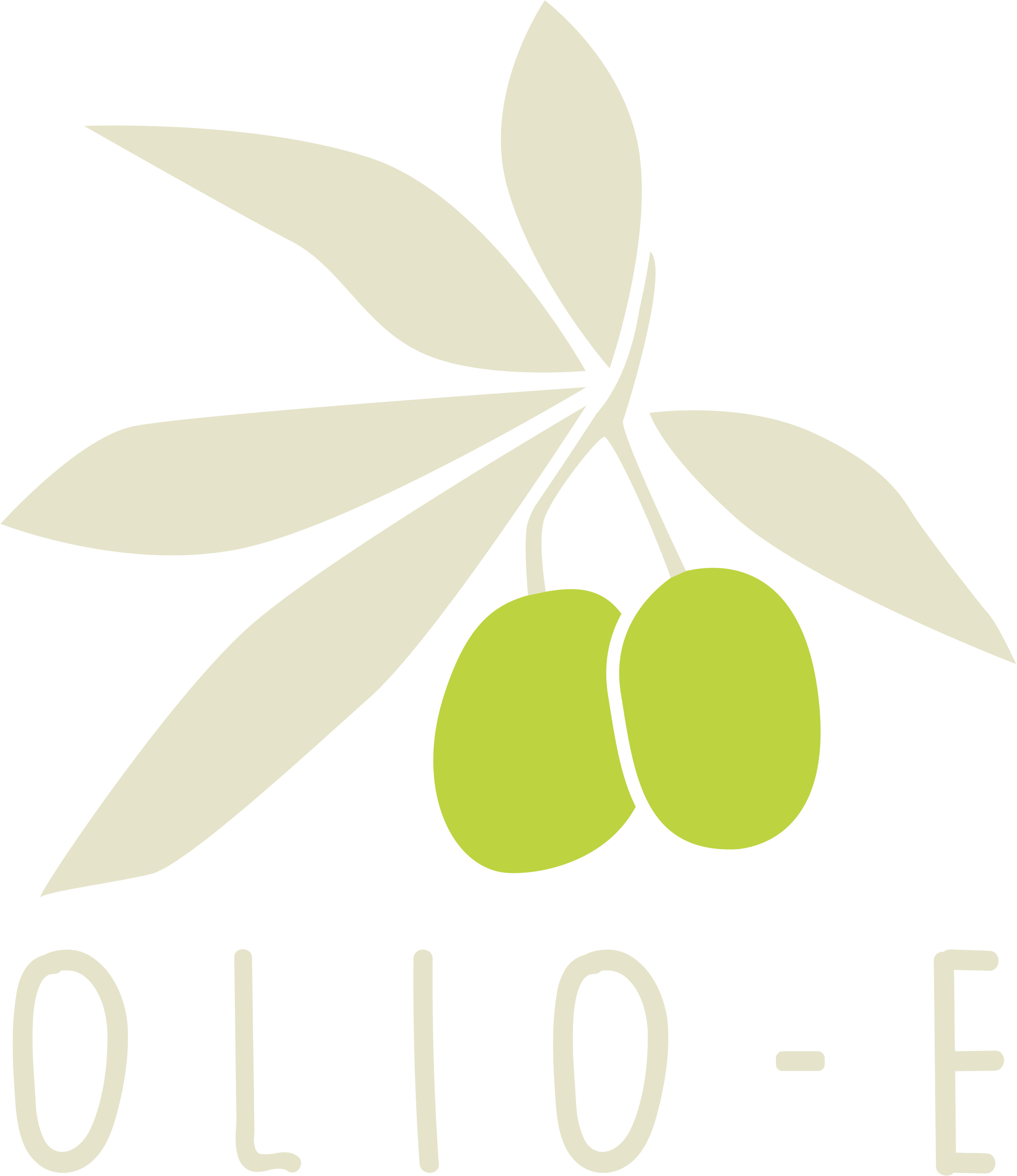
The mark is an olive branch drawn as a single gesture: five leaves fanning from one stem, two olives hanging at the pivot. Two fruits, two sommeliers. The wordmark is hand-lettered rather than typeset and the letters are pushed far apart — so the name reads like a label on a bottle instead of a logo on a truck.
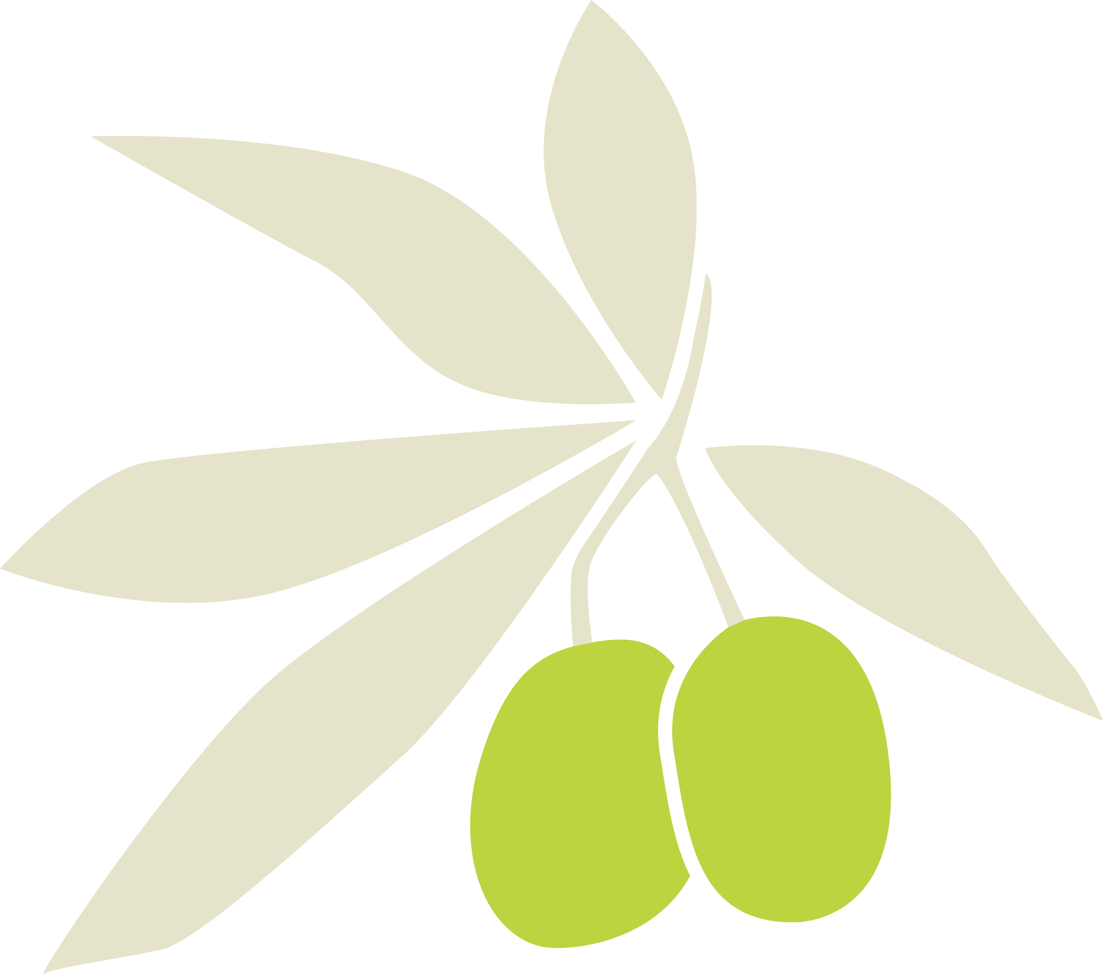
Stacked
Roll-ups, social, anything with height to spend.
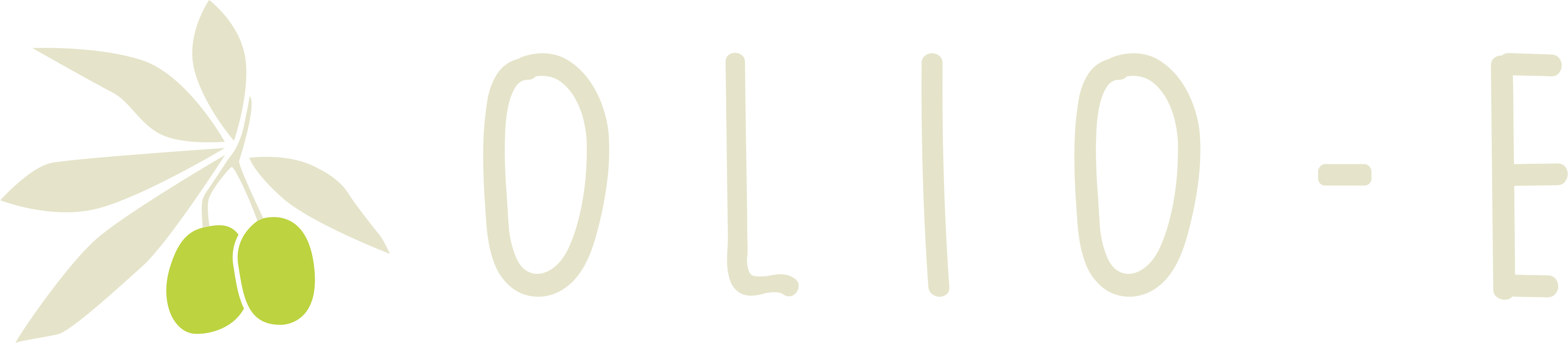
Horizontal
Letterheads, headers, the tasting sheet's top rail.
Mark only
Bottle necks, stamps, avatars — where the name is already known.
One colour, both directions. The branch keeps its silhouette at stamp size and reverses without losing the two olives — which is the whole job of a mark that gets printed more often than it gets displayed.
02 — The system
Palette, type, motif
Five colours, two typefaces, one recurring device. Small enough to memorise, which is the point — the owners apply it themselves.
Olive
#1D2D00
Base canvas
Surface
#232E16
Cards, panels
Accent
#BDD340
The olives — one focal use
Cream
#E5E4CA
Type on dark, light surface
Warm cream
#EFE1CD
Print surface
Display — Merriweather
Od Drzewa do Stołu
“From Tree to Table”
The heritage voice. Reserved for a single H1 per view — a serif earns its weight only when nothing around it competes.
Everything else — Manrope
Panel Degustacyjny
“Tasting Panel”
Akademia Oliwy
Headings, body, numerals — and the signature: labels set in spaced uppercase, echoing the gaps in the wordmark itself.
03 — In print
Where the system leaves the page
Every piece below is the same five colours, the same two faces and the same branch — scaled from a business card to a two-metre banner.


Also delivered: a two-sided business card, a written design system, and the logo pack itself — three lockups in colour and mono, as SVG, PNG and JPG, so the owners never have to ask for a file again.
olio-e.shop ↗︎